At the time, MasterLift was a Mitsubishi forklift dealer. That’s a major brand in the forklift world, and carries with it no small amount of cachet in the industry. But Gary wanted rid of them. Amongst other reasons, they wouldn’t let him sell the more upscale Caterpillar forklift, even though they were essentially the same (that is, in the same way a Chevy is the same as a GMC). He was looking at sourcing his own forklift from China, and selling it in Ontario under the MasterLift name. As a means of establishing some differentiation of the new MasterLift product right out of the gate, Gary wanted to offer customers the option of slapping their corporate logo on their forklift.
His challenge to me was to produce a presentation that would pitch the corporate branding concept to potential partners and suppliers.

As the site build began, Gary organized a photo shoot. We needed photos of models sitting in the forklift for the website, as well as some visuals for print advertisements. The models Gary had sourced were notably all female. Even if the intent was to spoof those archaic-looking Snap-On Tools calendars, we still added one of our own forklift technicians to the mix in a last-minute and feeble attempt to even things out.
The final shot of the day was of all the models draped over a MasterLift forklift, exactly like something from those Snap-On calendar. I still shudder when I recall one of the models pretending to lick the forklift.
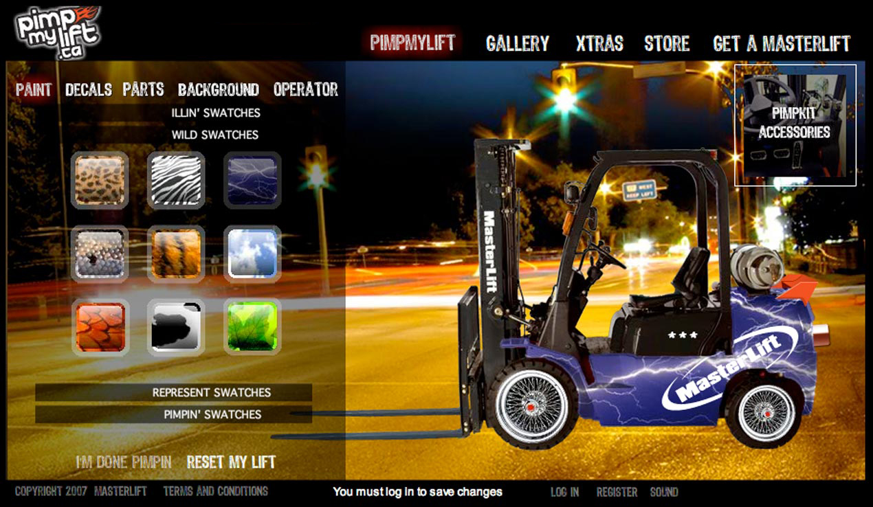
Ultimately, the website didn’t stop with paint jobs and accessories. We gave users the option of placing the forklift against one of several backgrounds, from an aircraft carrier deck to the African savannah. The site allowed visitors to save their creations to a gallery and share them with friends. A user rating system awarded a monthly prize to the most popular forklift.
